Background
IGA (Infinity Gems An Thịnh) sells gemstones, carved stones, jewellery and feng shui items, with more than 5,000 products. Customers mostly buy them as gifts. Every product photo is a real photo taken in the shop, so the design has to look good even with hand-held shots.
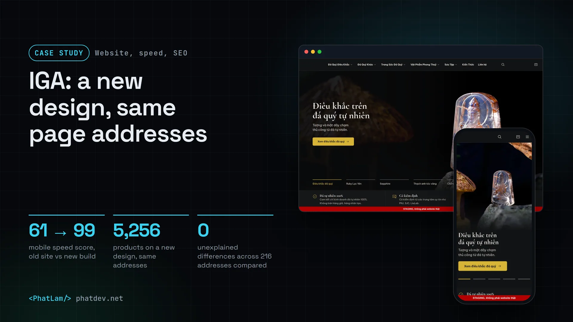
The old site ran the Flatsome theme, and its home page carried more than 100 images. I rebuilt it with a custom theme (called iga) and a custom plugin (iga-core), keeping every page address the same. The new version runs on a test copy; the live site still uses the old design. So every "after" number in this case is a test-copy measurement.

The problem
On 13 Oct 2026 I measured the old site. The home page scored 61 for mobile speed, and it took 8.6 seconds for the largest part of the first screen to appear (this measure is called LCP). There were four main causes: the page was rebuilt on the server for every visitor, the top image was not loaded early, several scripts blocked the page from showing, and third-party tracking code loaded right away.
Three constraints came with it.
First, no loss of Google ranking. Page addresses, main menu names and policy wording had to stay as they were.
Second, the 5,256 products had descriptions only. There were no attributes to filter by stone type, size or matching element, so visitors could only browse one page at a time.
Third, the product descriptions are the shop's own words. I was not allowed to edit them to make the data look tidier.
How it was done
1. Measure before drawing anything
I ran Lighthouse (Google's speed-scoring tool) on 4 kinds of page: the home page, one large category (1,384 products), one product page and one article. Each page was measured 3 times in a row and I took the middle run. The targets: mobile from 95, desktop from 98, layout shift (CLS) under 0.05.
2. Build filters from the description text, without touching the data
I wrote a reader that pulls product type, stone type, stone group, size, weight, origin and matching element out of the description text. The lookup tables live in JSON files that can be edited by hand and have tests that check they stay consistent.
Before writing anything, I did a dry run over all 5,256 products, read-only. It took 3.0 seconds. Checksums of 9 WordPress tables were compared before and after: identical. The result: product type recognised for 100% and stone type for 99.7% of products. The 372 uncertain lines went into a list for a person to review instead of being guessed, covering 280 products (5.3%).

For the matching element, the Five Elements colour table for 62 stone types lives in exactly one file. The rule is simple: each colour belongs to one element, and a stone suits the same element plus the element that produces it. The website only says "suits", never "avoid". A stone with several colours and no clear answer is left blank, not guessed. Where the reference sources disagree (for example which element purple belongs to), one choice is made and the reason is written down. Sales advisers have an internal page to choose the matching element for each stone type, and one click saves it.

3. A new design, with the text kept as it was
I tried three design directions and chose neutral black with gold accents, because it keeps the logo's colours and the stones stand out more on a dark background. The home page and the intro pages are built from a set of custom blocks (iga/*) so staff can edit them in the editor without asking a developer.
The 40 pages originally built with Flatsome's UX Builder were moved to the new blocks with one command. The command compares each page's text before and after and writes only when they match 100%.

4. Compare every address with the old site
I made a fixed list of 216 addresses: the home page, 57 categories, 77 products, 25 articles, 20 pages, cart, checkout, search, filtered addresses, 404 pages, robots and the sitemap. A tool compares each address tag by tag between the old site and the new build: status code, title, description, canonical tag, robots tag, Open Graph, H1 and structured data.

The first run flagged a great many differences. Most were false alarms from a tool that was not precise enough yet, but it also caught 10 real bugs. For example, a nonexistent address was being pushed to the home page by a plugin instead of returning a proper 404, and the short description of many products had disappeared from the page. Both were fixed in the theme.
Results
These are lab numbers, from Lighthouse 13.5.0 simulating a phone on a slow network, using the middle of 3 runs. The old site was measured on 13 Oct 2026 through the real Cloudflare, with no page cache for the HTML. The new build was measured on 8 Nov 2026 directly on the test server, with a page cache and not behind Cloudflare. The two setups differ, so part of the gap comes from caching and the network path, not only from the design.
Lighthouse 13.5.0 simulating a phone on a slow network, 3 runs in a row, middle run taken. Before: the old site on 13 Oct 2026, measured through the real Cloudflare, with no page cache for the HTML. After: the test copy on 8 Nov 2026, measured directly on the server, with a page cache and not behind Cloudflare. The setups differ, so part of the gap comes from caching and the network path.
Mobile, taking the middle run of 3 (the same way the old site's figure was recorded). Before: 13 Oct 2026, through Cloudflare, with the HTML taking 0.5 to 0.9 seconds to arrive. After: 8 Nov 2026, on the test copy, with the HTML arriving in 30 to 40 milliseconds thanks to the cache, so part of the LCP drop comes from caching.
Total network weight of the middle mobile run, measured with Lighthouse. Before: 13 Oct 2026. After: 8 Nov 2026. The large category is slightly heavier because each page still shows 24 products with photos. Approximate figures, read them as an order of magnitude.
Mobile speed on the 4 page types went from 61 to 80 up to 97 to 100, meeting the target of 95. Accessibility went from 88 to 92 up to 98 to 100, and Best Practices from 96 to 100. Layout shift (CLS) is between 0 and 0.02, under the target. The large category page is still as heavy as before (862 against 846 KB) because each page still shows 24 products with photos.
On SEO, of the 216 addresses compared on 13 Oct 2026, 4 matched character for character, 212 differed only where it was intended or better than the old site, and 0 differed without an explanation. An example of "better": the old site printed two conflicting canonical tags on page 2 of categories, while the new build prints one. 2,231 internal links were checked, and 3 returned 404, all inside the descriptions of 3 products.


One thing is not done. The new build is not open to customers. Every "after" figure above comes from the test copy, so when it goes live I have to measure again over the real network, including Google's public PageSpeed tool.
Lessons
Measure the old site first, then set targets. Having 61 points and 8.6 seconds on paper showed me that caching and the top image came before any change of colour or font. I wrote up the 5-minute way to check speed yourself in How a Slow Website Costs You Customers, and a 5-Minute Speed Check.
Do not edit the data to suit the design. The filters were built next to the descriptions, uncertain cases went into a list for a person to review, and a read-only dry run with table checksums gave me confidence when I pressed the real write button.
Keeping the addresses matters more than a pretty design. A tool that compares each of the 216 addresses tag by tag catches bugs a human eye would miss, such as doubled canonicals or duplicate H1s. What a shop owner can do alone is in Basic SEO for Online Shops: What Owners Can Do and What Needs a Developer.
For wording about promises and trust, use only the wording that already exists on the original site. I went through every sentence in the new design against the old pages, and dropped any sentence that was not there.
Need something similar?
If you have a WordPress or WooCommerce shop that is slow on phones, or you need a new design without losing your search ranking, send me a few lines about the site. I will measure first, list the addresses that must stay, and tell you plainly what is worth changing and what should stay as it is.